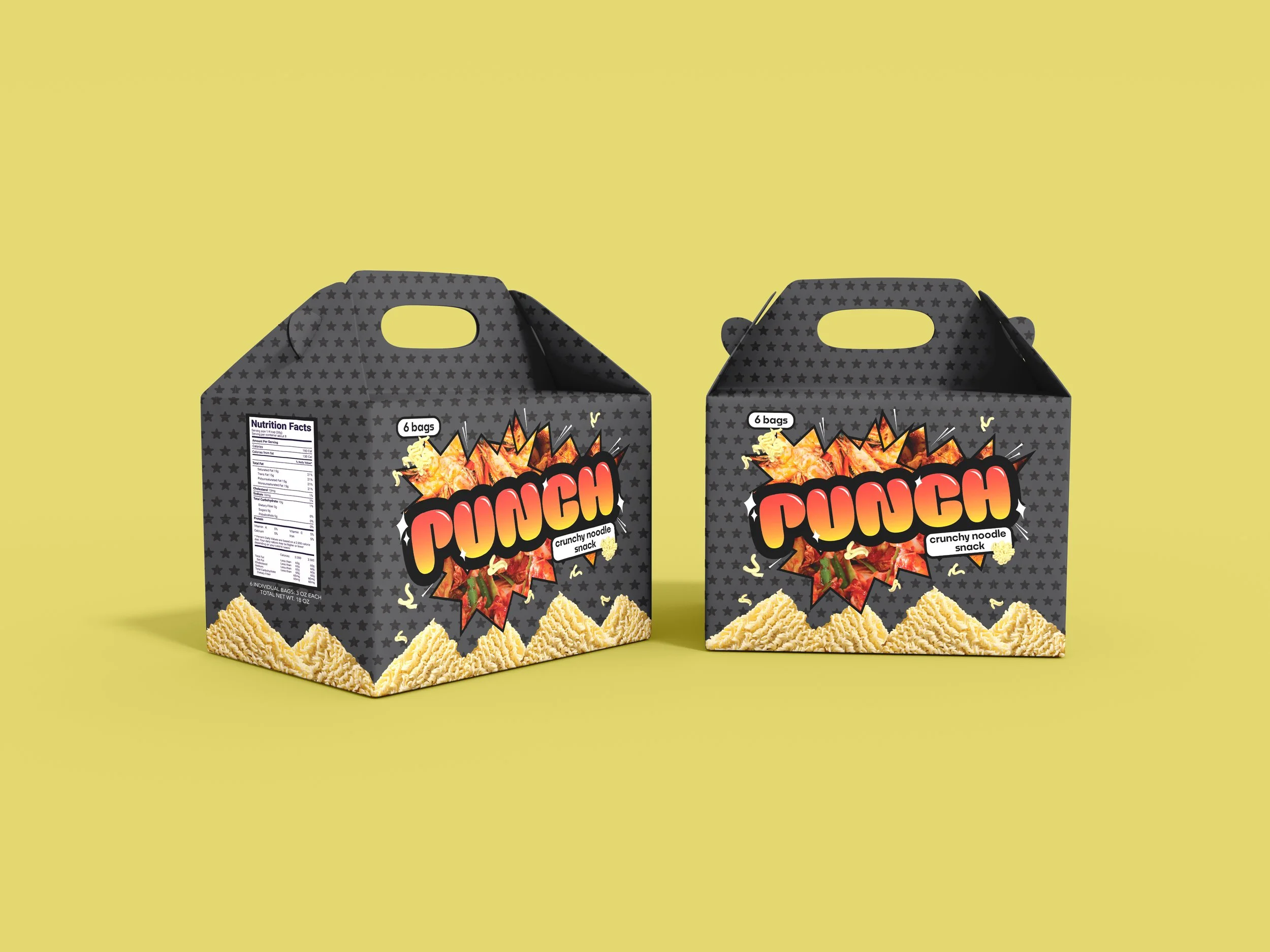

PUNCH Ramen
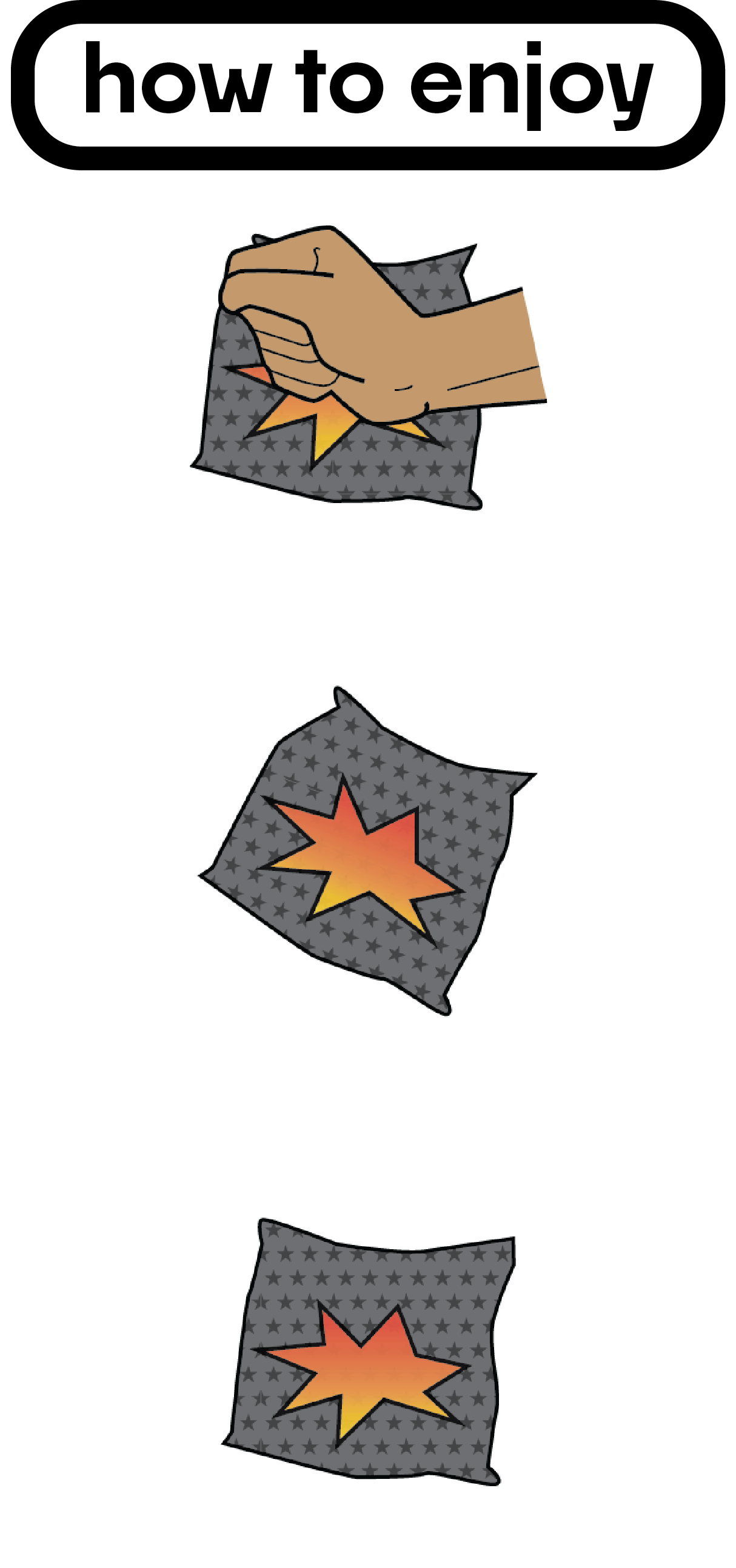
Boiling noodles in water is not the only way a pack of instant ramen noodles can be enjoyed. Customers have found different ways to eat this meal — like crushing up the uncooked noodles and sprinkling the flavor packet into the bag. Growing up, my friends and I ate this as a quick snack at school and at home when we didn’t feel like cooking and were craving something crunchy, flavorful and easy.
PUNCH was created during my time in Package Design at UCLA Extension. There are few products on the market with ramen noodles that are mean’t to be eaten exactly like this, however all of the packaging is outdated. I wanted to create a crunchy noodle snack that looks eye-catching and enticing on the shelves with a modern yet playful design.
How can I make a convenient and simple snack where the design is just as exciting as its flavor?
About
[branding]
[package design]
[typography]
[logo design]


PUNCH has three different flavors: grilled chicken, garlic shrimp, and kimchi. I wanted to create flavors that are not typically seen on the market rather than having the traditional “chicken,” “shrimp,” and “vegetable.” Customers will always have a variety to choose from in the 6-pack box.
Logo Work

All of the logo work was done digitally on Illustrator. “Burghi” and “Force” were the two final contenders out of the many cartoon-y fonts I found online. While Force has a fun video game aesthetic, I chose Burghi for it’s rounded edges and how it makes PUNCH’s packaging more updated rather than Force’s very retro look. A lot of the imagery in the logo work is inspired by Nintendo designs and old video game color palettes.
Iconography
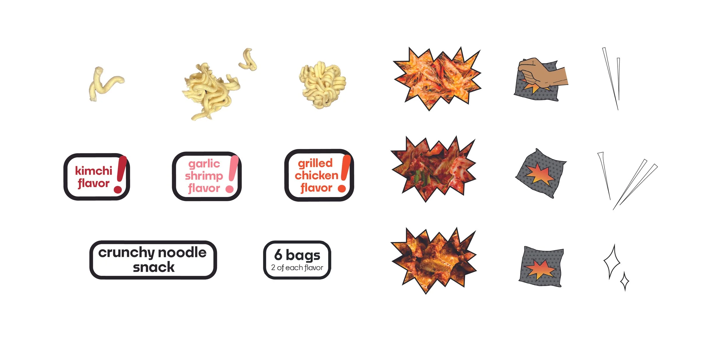
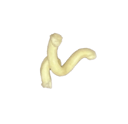
A lot of different icons went into the design of PUNCH to develop the superhero-like branding that it has now. To emphasize the “PUNCH” of flavor you get when eating this snack, I included pieces of ramen that fly around the packaging, large exclamation marks to bring attention to the flavor profile, and sparks around the images of shrimp, kimchi, and chicken to create explosive imagery.
Color Palette
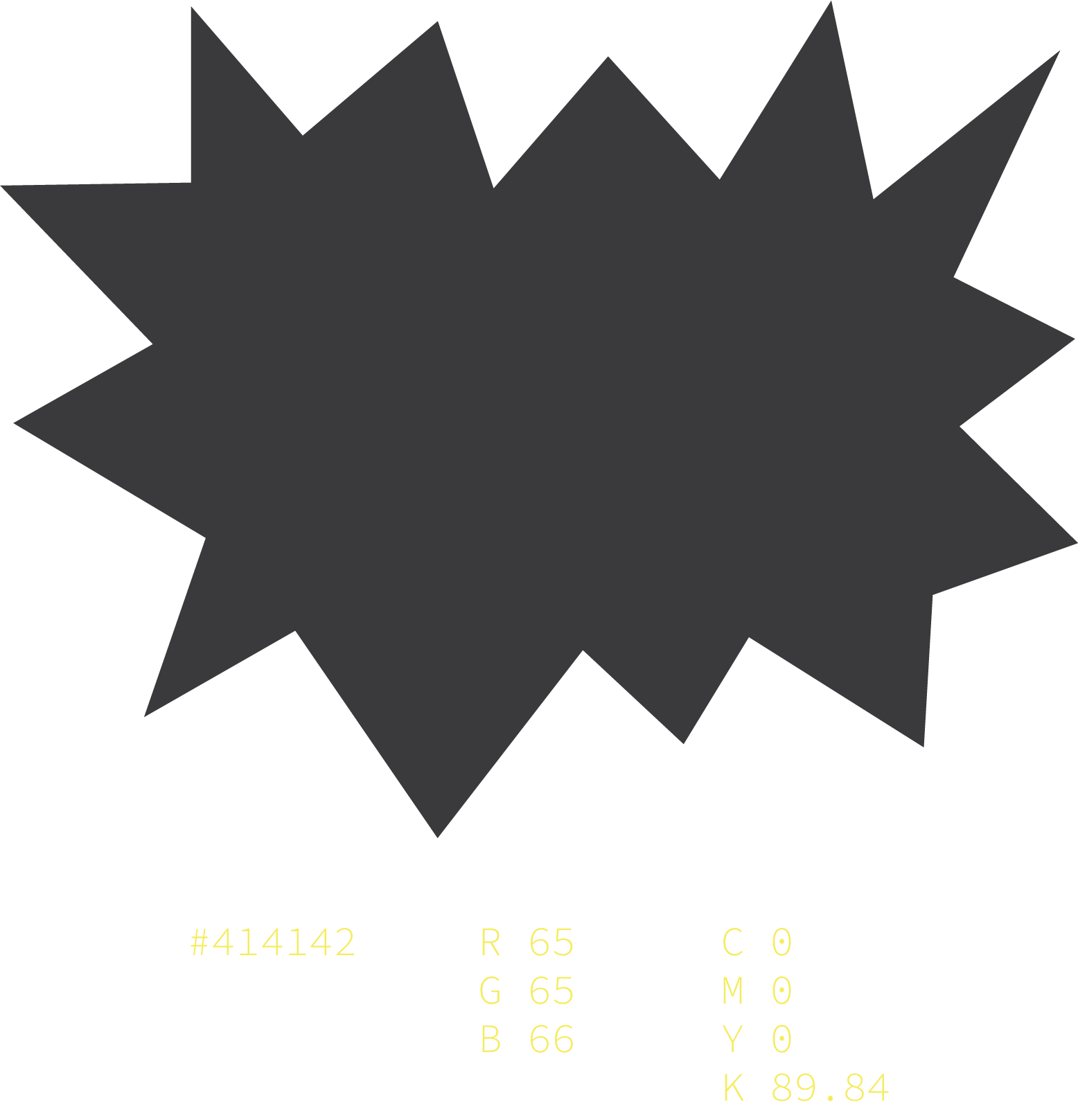


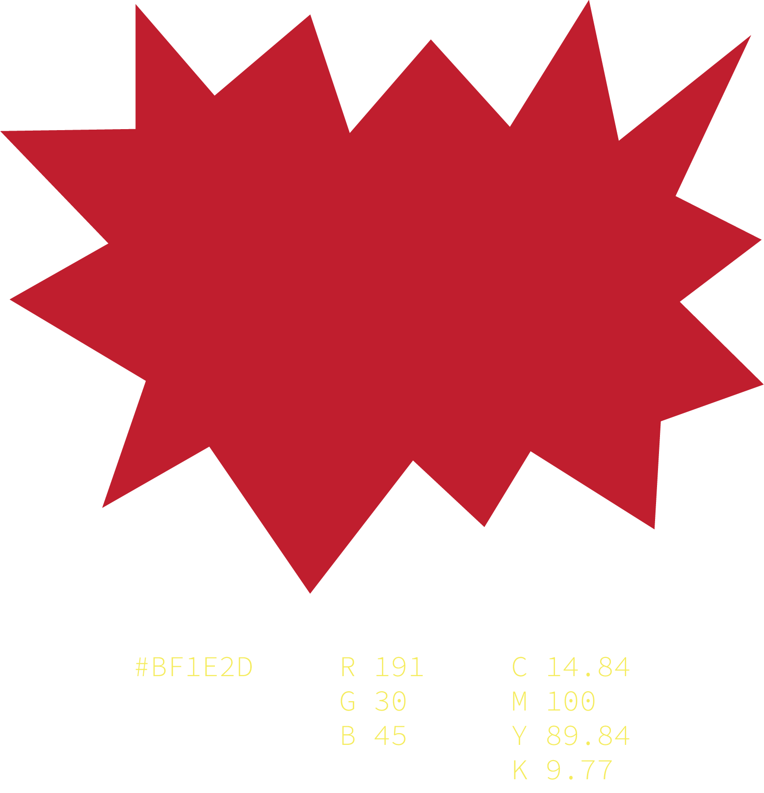
PUNCH’s packaging has a dark gray background to help each flavor stand out. I chose one bold color for each flavor to make them identifiable from each other, pink being “garlic shrimp,” orange being “grilled chicken,” and red being “kimchi.”
Font Choices
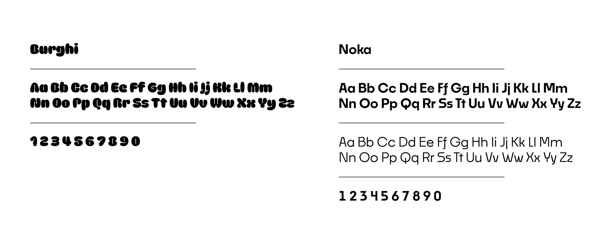
“BURGHI” was used for PUNCH’s logo because it was reminiscent of how a cartoon character’s face can comically puff up after being physically punched — very fitting for PUNCH’s cartoon-y and fun design.
“Noka Semibold” was used for the various labels on the packaging. With this font’s minimalist look, I thought it was a good contrast to the brand’s logo.