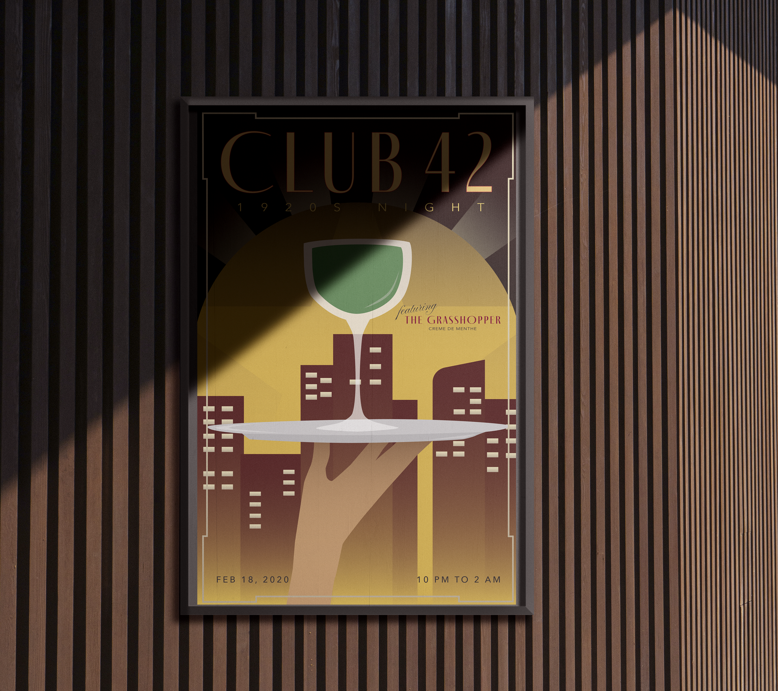

Club 42
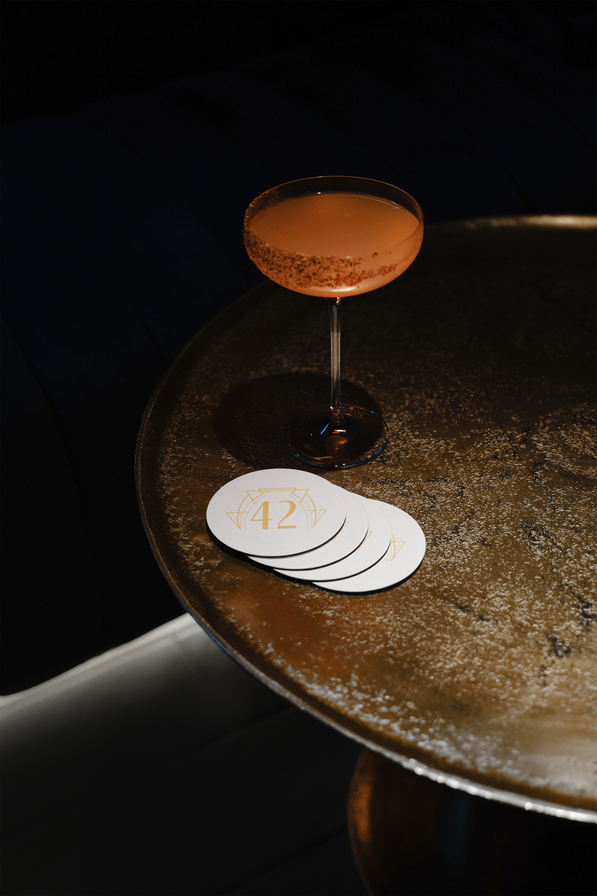
Club 42 is a bar inspired by the 1920’s art style and rising culture in nightlife during that time period. This concept began during my Design History class at UCLA Extension after I made one poster in an art deco style promoting a popular drink during the Prohibition Era. I expanded on this idea and made a corresponding poster and products like coasters and aprons to curate an atmosphere reminiscent of the luxury and glamor of the 1920s.
About
[poster design]
[typography]
[product design]
[event branding]
Mood Board

The ornate architecture, geometric lines, muted colors, extensive color palettes, and mixed drinks inspired the pair of posters designed for Club 42.
Colors

Palette 1
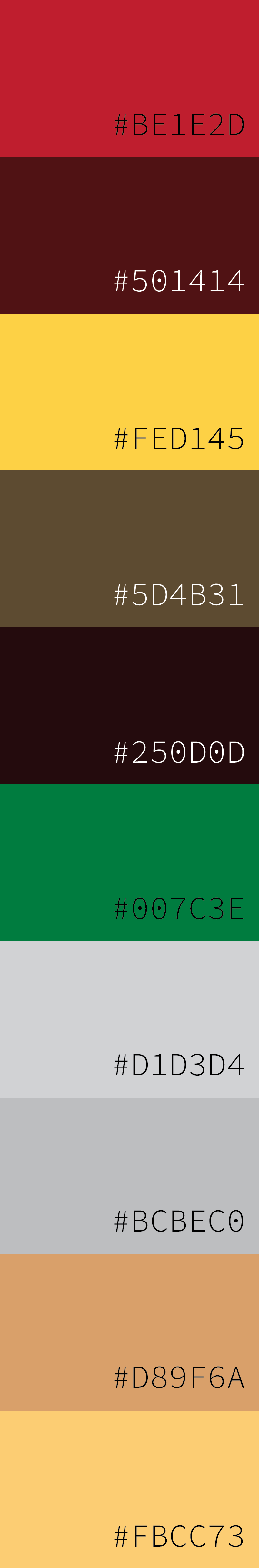

Palette 2
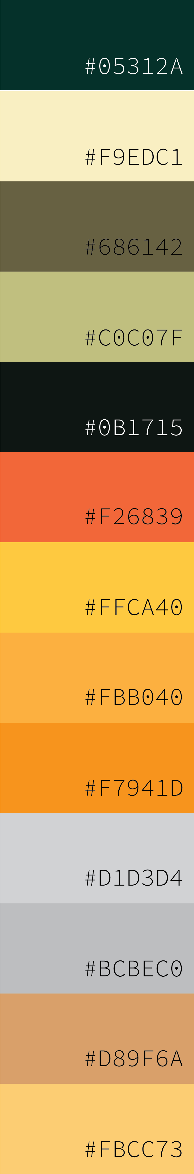
The color palette was chosen with the intent to make the drink the focal point. The background is inspired by the muted colors from the mood board, with the drinks being a bright pop of orange and green to create contrast.
Font Choice

Fino Sans Regular is used as the primary font because of the art deco style it gives off. The secondary font is a simpler and more understated style, which I thought was perfect to use for secondary information on the poster.