
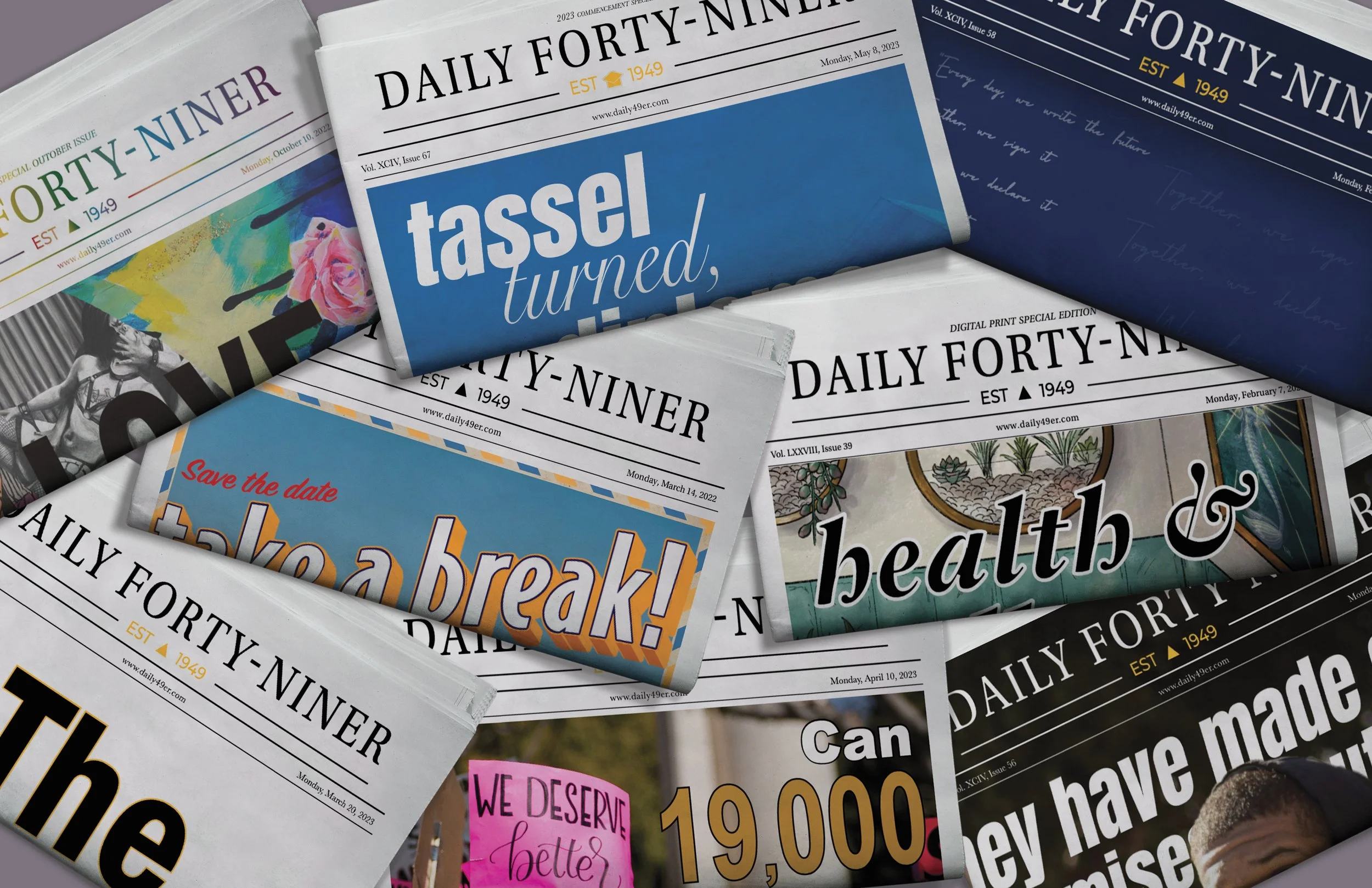
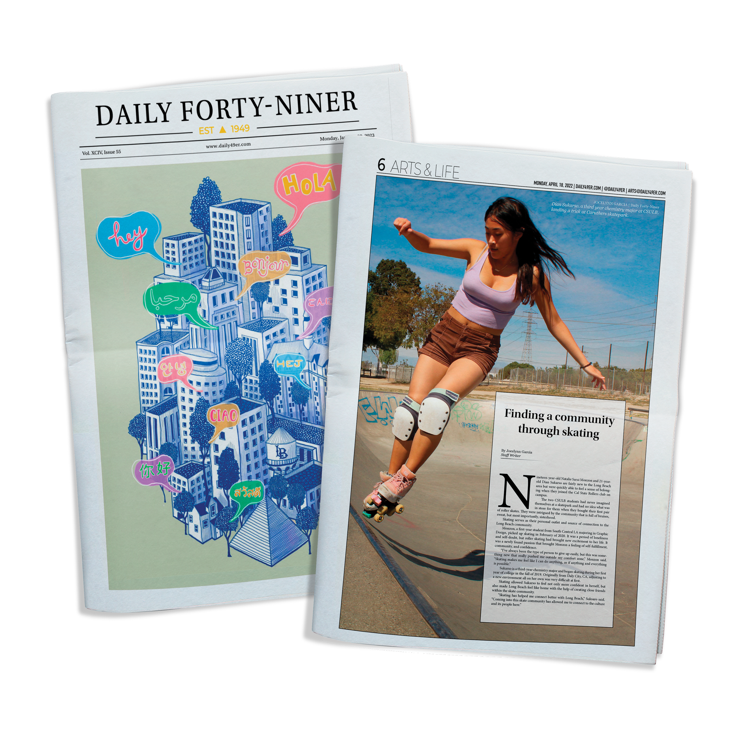
Daily Forty-Niner
The Daily Forty-Niner (known as the Long Beach Current as of 2024) is CSULB’s award winning publication primarily run by students. It covers campus and city news, arts and life, opinion, and sports with a new issue coming out weekly.
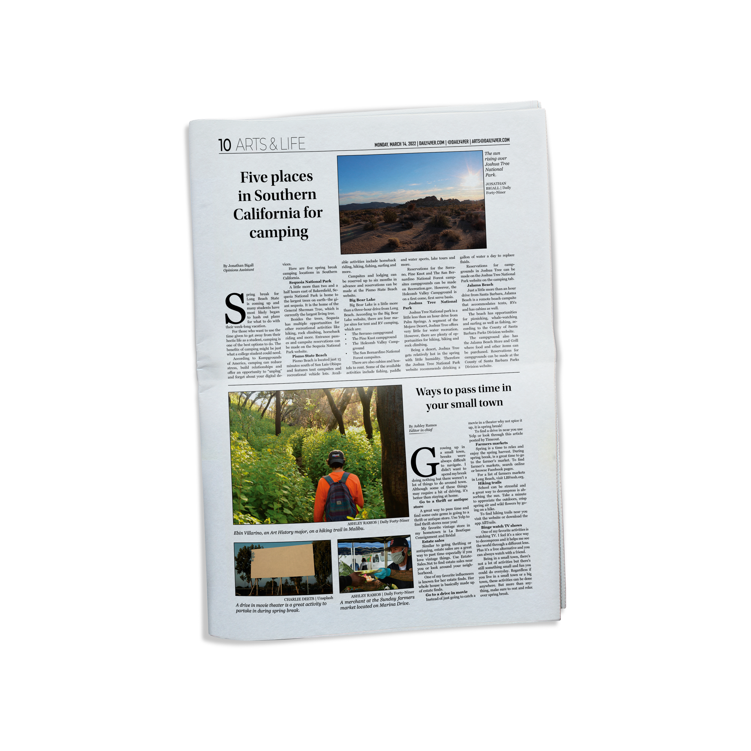
I was in charge of designing for the digital and print editions alongside my design deputies from 2021 up until I graduated in 2023. I was promoted from Design Editor to Creative Director after one semester, received awards each year from the California College Media Awards, and gave the paper a refresh during my final semester.
During a time where technology and social media are my generations main sources of news, having more and more students pick up our papers around campus was always my goal. How can I as an editorial designer keep print media alive for the young consumer?
About
[editorial design]
[layout design]
[typography]
[branding]


Long Beach has a big LGBTQ+ community on campus and throughout the city. OUTober is recognized as CSULB’s pride month and the publication honors that by releasing a special print edition every October. This spread from 2021 was my first Outober edition and was recognized by the CCMA

Another print edition for Outober 2022. The cover was designed by me as a last-minute change after plan A fell through.
This edition ended being picked up by students more frequently than any other recent print editions because of this design.

My consistent design work was recognized by the CCMA. I was always aware of how to stay on brand while still keeping the paper fresh when designing the pages each week.
A little refresh…
Before
After
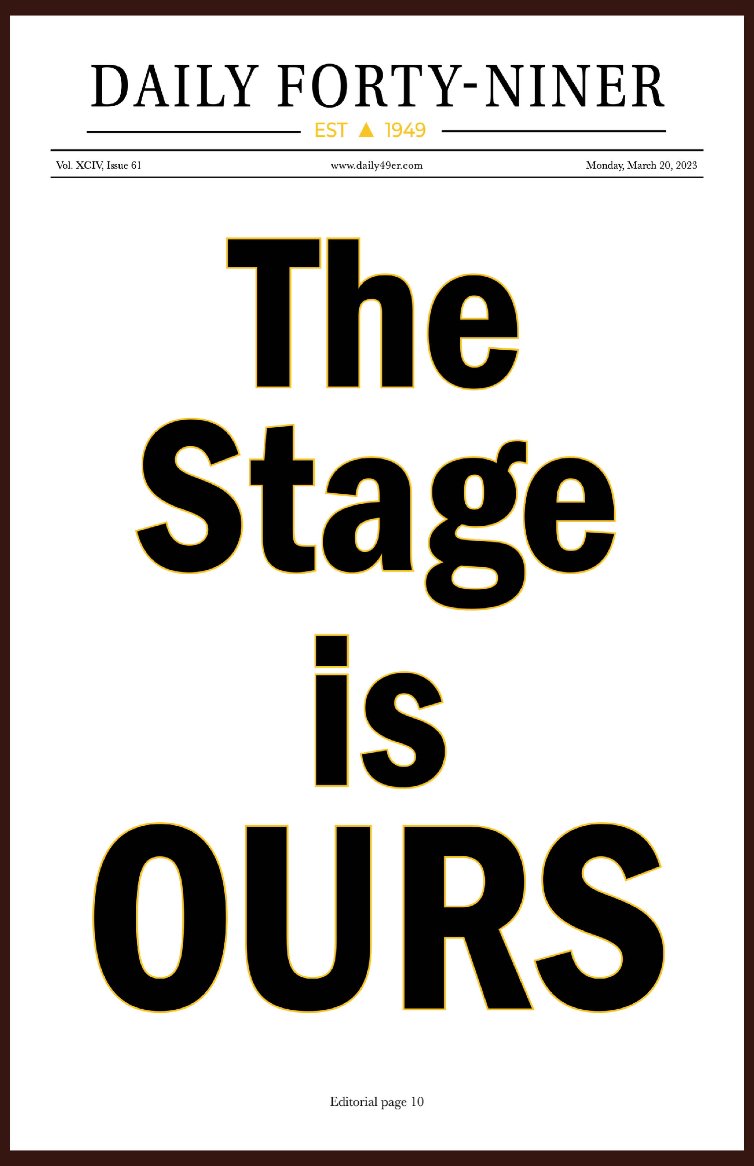
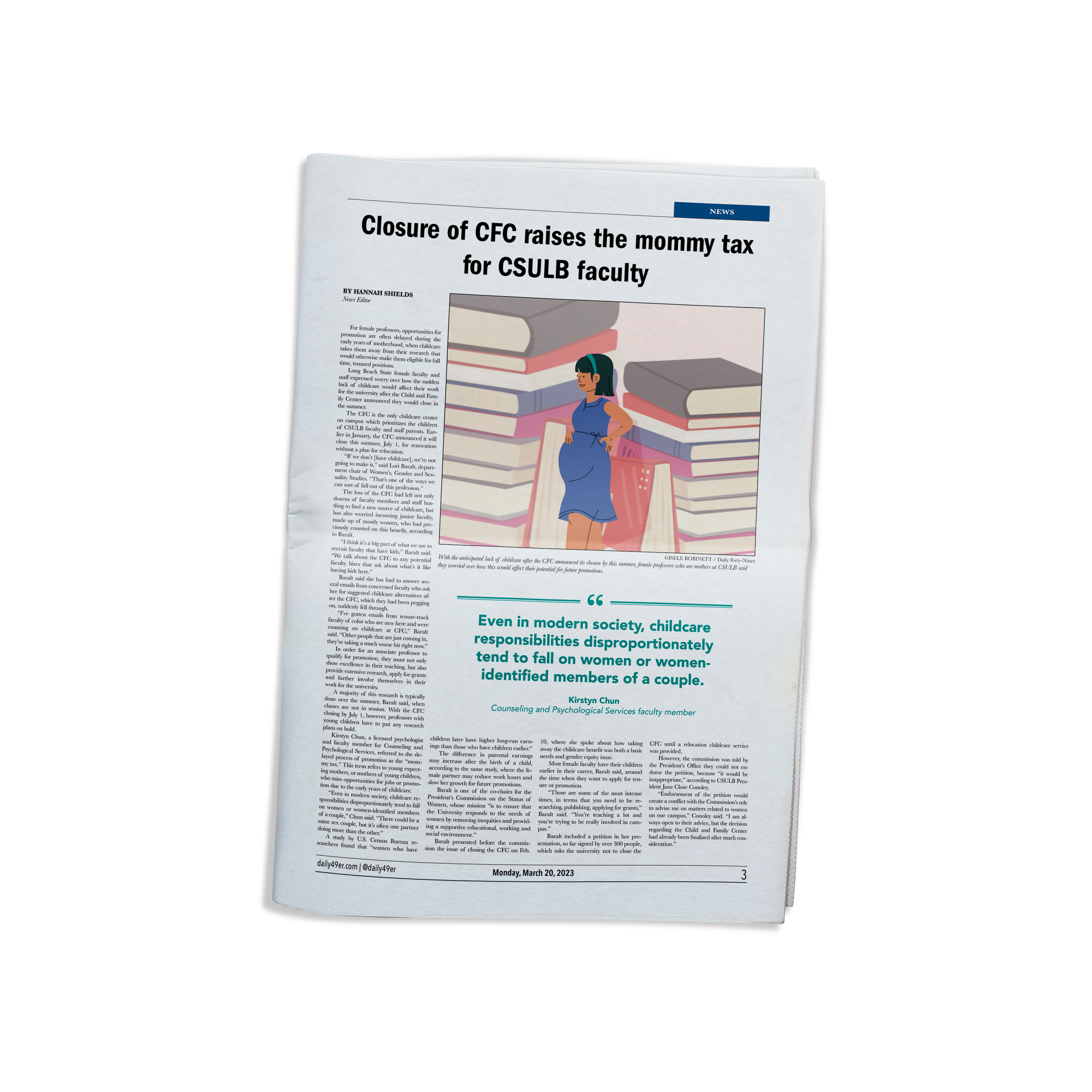
The Daily Forty-Niner went through a refresh that was implemented on March 20, 2023. I chose new fonts for body copy, headlines, bylines, page numbers, and photo credits. I also redesigned the formatting for the page numbers and pull quotes. I prioritized a clean and professional look while still maintaining brand identity.
Body Copy

Georgia and Baskerville definitely have similar attributes, but what I like about Baskerville is how much slimmer and lighter the font is compared to Georgia. I thought Baskerville was perfect for body copy for its readability and different weights.

Headlines
All of the Daily Forty-Niner’s fonts had serifs before the refresh. I wanted to take a break from that and use a sans serif font for the headline. Franklin Gothic URW was perfect to give the paper a modern look, especially because a headline can be the most noticeable and important aspect of an editorial page.

Page Numbers
Avenir Next Condensed was chosen for the page footers because of its small width. I have a lot of information to put at the bottom of the page like our domain name, page number, and date so I wanted to choose a font that will allow me to do that without looking crowded.