
Surfrider Organization
Access to beaches is insufficient in many coastal areas, which is why fair and full beach access for everyone is one of Surfrider’s missions. Humans are the primary cause of ocean pollution with around 8 million tons of plastic entering the ocean yearly, most of the pollution coming from land.
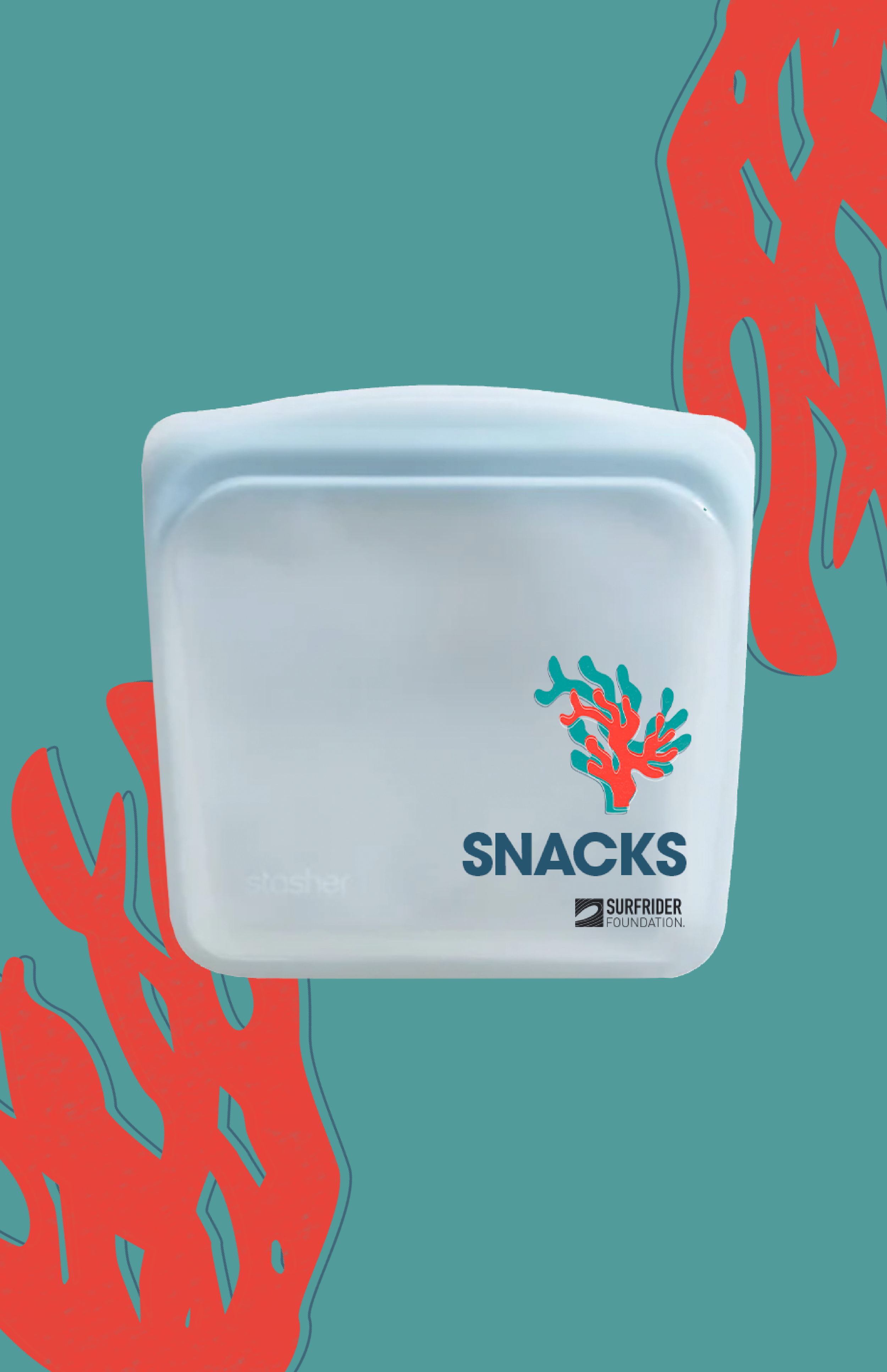
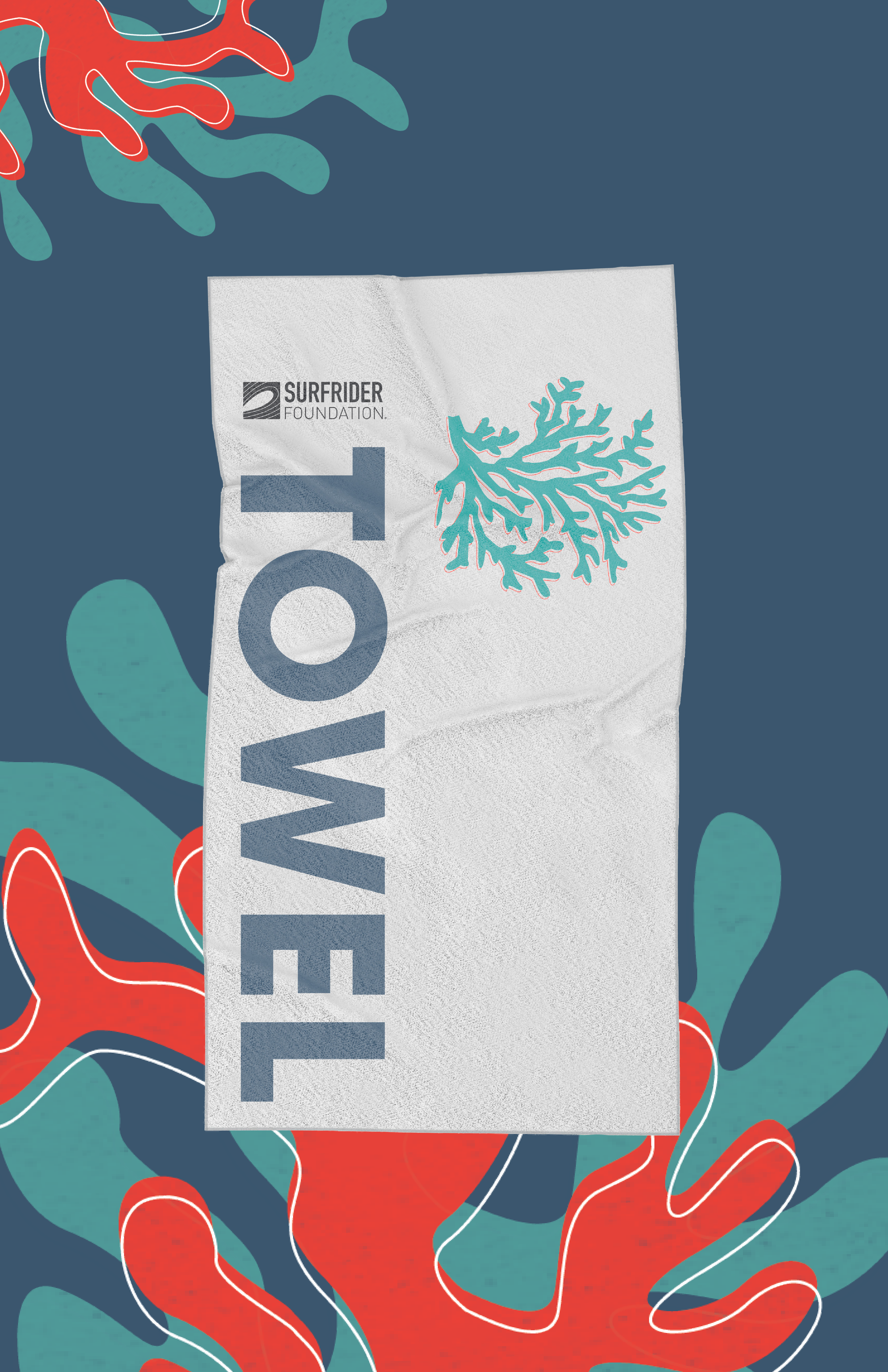
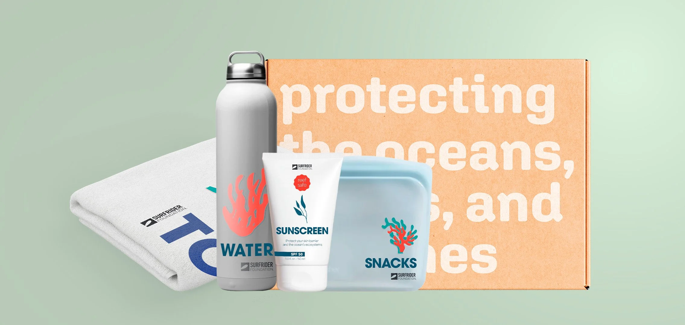
I wanted to promote Surfrider’s value of beach access and also uphold their missions of plastic reduction and ocean protection by giving Surfrider members eco-friendly beach day essentials. The promotional package includes a towel, reef-safe sunscreen, aluminum water bottle, and Stasher snack pouch.
About
[product design]
[promotional design]
[typography]
[branding]
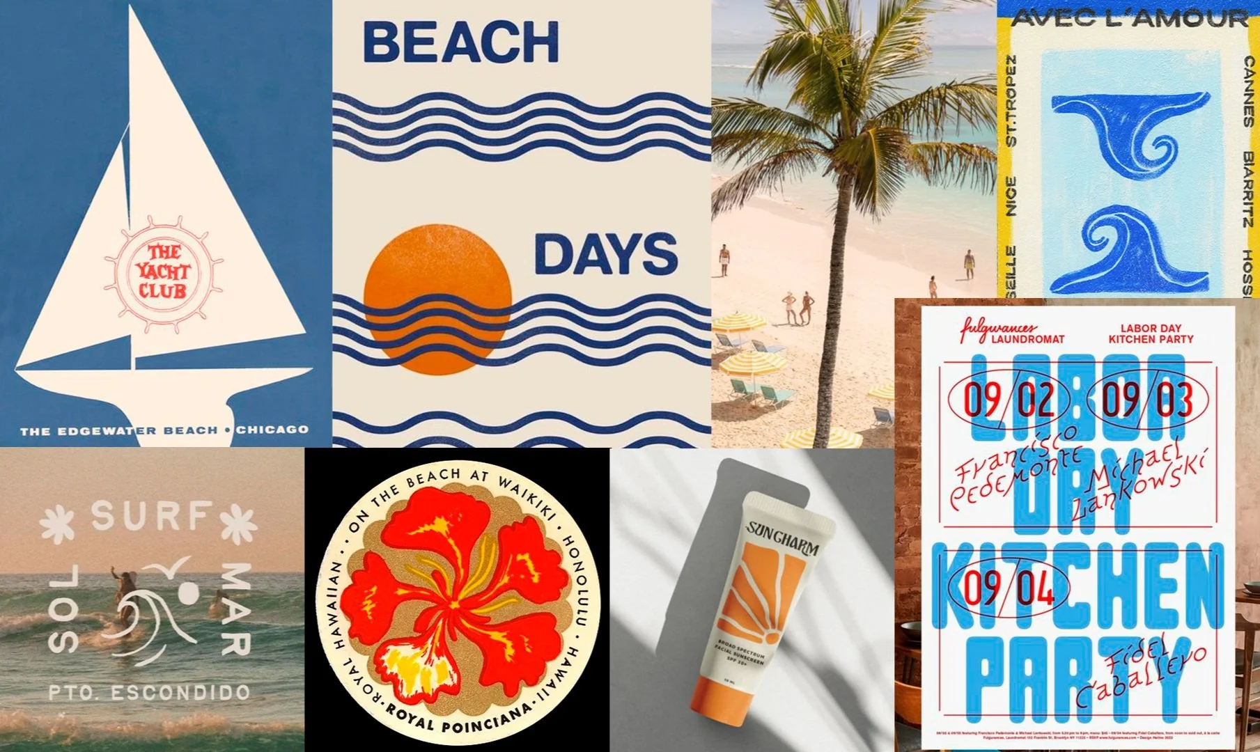
Moodboard
Typography

ITC Avant Garde Gothic Pro was used to label each product in the gift box. This font is distinct and eye-catching to point out each item in an amusing way, making the sunscreen, stasher bag, water bottle and towel stand out to beach-goers.
The message on the front of the box is in Aglet Sans. This font is understated and friendly to fit the minimalist aesthetic on the outside of the box.
Area is used for the sunscreen bottle design. Area pairs well with ITC Avant Garde Gothic Pro as the light font contrasts with the bold lettering to create hierarchy.
Color Palette
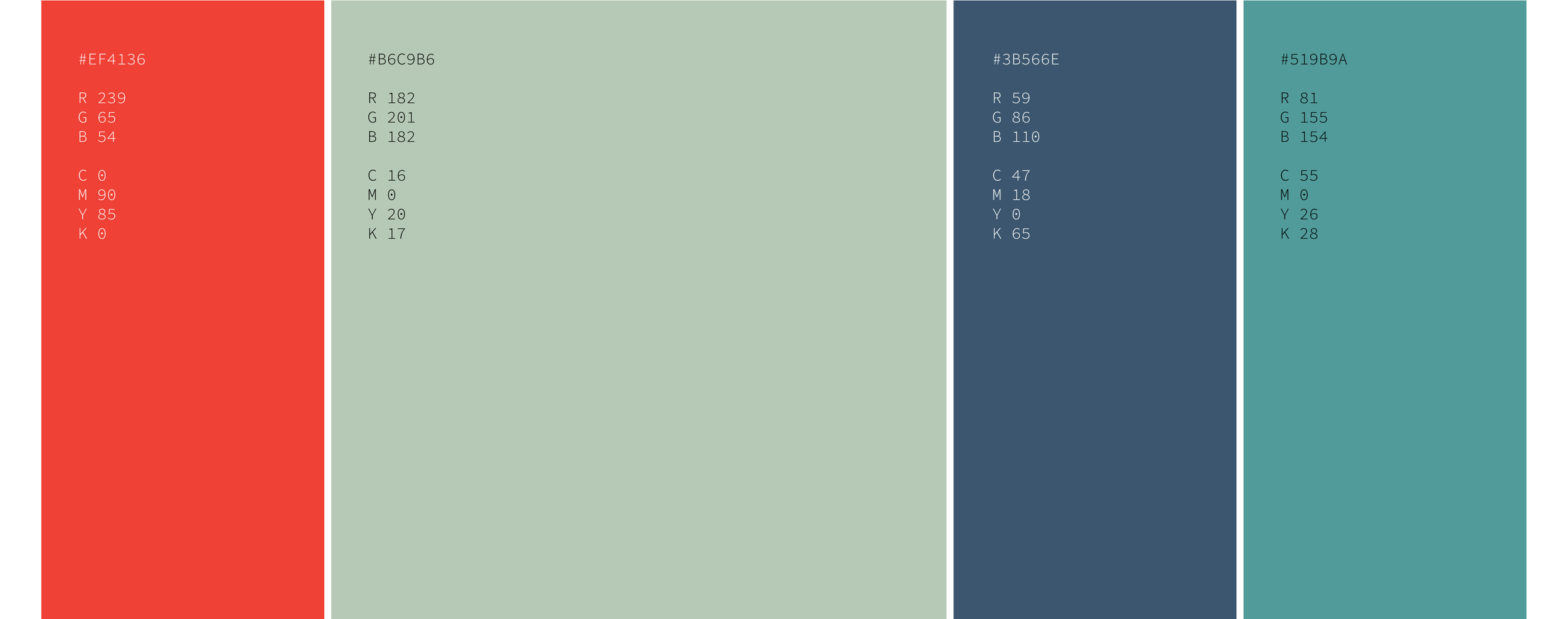
I wanted to have an enticing and bright color palette for the packaging. I used three different shades of blue to create a monochromatic yet beach-y style. I thought it was important to include a pop of color like the lithograph style images you see on my mood board and chose a bold red.
Iconography
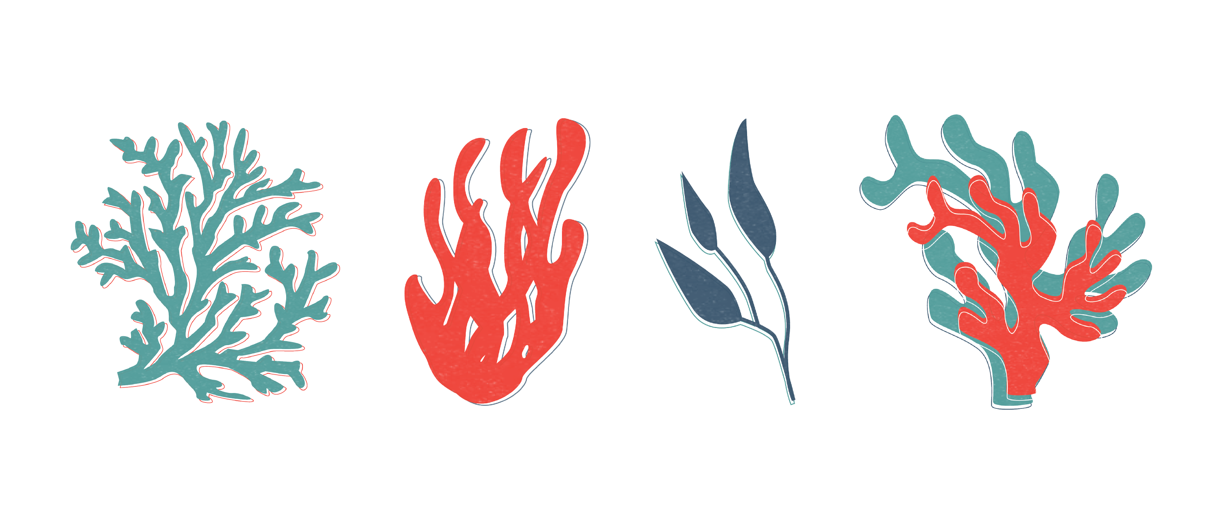
Coral reefs are some of the most diverse and colorful ecosystems on our earth. Coral comes in many different shapes, colors, and textures, which I thought was perfect to have as icons for the inside of the promotional package. I added outlines and light texture to help each icon stand out from each other and to represent the diversity of these environments.
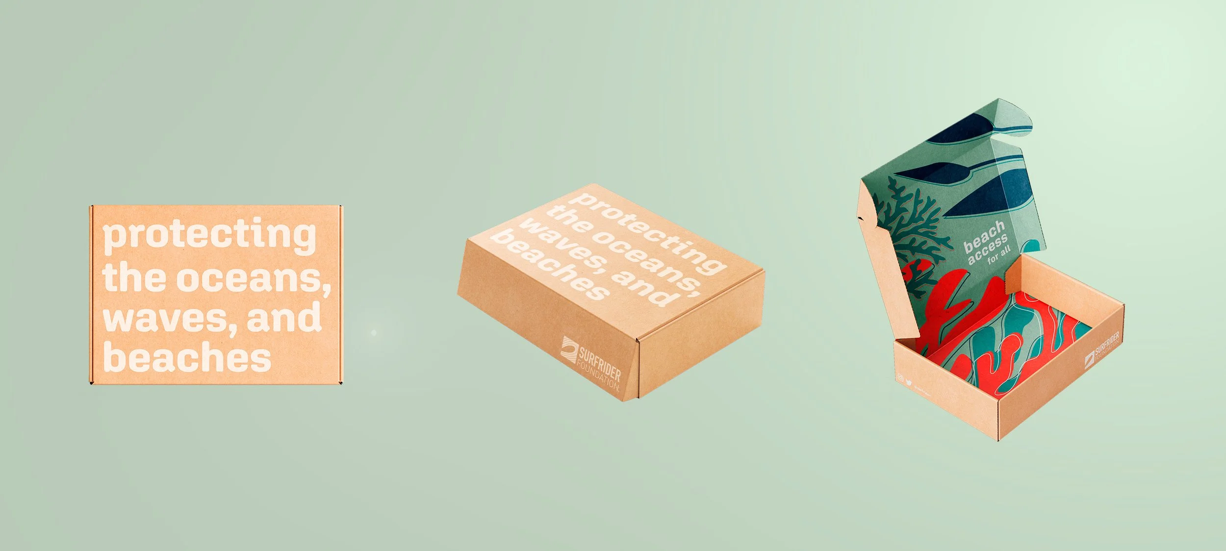
I brought attention to Surfrider’s action, “protecting the oceans, waves, and beaches” and made it the focal point of the outside packaging. The outside is minimal in it’s color and design, so when someone opens the box they are surprised with an explosion of color.